The COVID-19 pandemic has completely changed our lifestyles in past couple of months, quite permanently in some aspects. With advice from the governments around the world to socially distance ourselves from each other to reduce the spread of the disease, could this lead to changes in social behaviours? Even better, could this be the push towards adopting greener modes of transportation and being more self-sufficient?
With Lockdown measures being initially announced for the UK on March 23rd and advice to only use public transports if you absolutely must, it’s no surprise that Londoners have turned to cycling to get around.
We’ve also seen companies like Halfords and Evans cycles struggling to keep up with the demand for bicycles and accessories, with some stores having long queues outside. However, even though there is a supply problem, this doesn’t seem to be stopping Londoners from adopting cycling as their go to mode of transport. The streets in the last few weeks have had a lot of Londoners wobbling along on Santander Cycles and other cycle hire schemes.
So, has there really been a surge in cycling activity in the city?
Are Londoners cycling more after lockdown compared to before?
Which are the hotspots in the city that see the most cycle journeys?
Let’s investigate the above questions by analysing some publicly available datasets. Although it would have been ideal to have access to data or sensors that monitor all of the cycling activity in the city, I’ve just used the publicly available TFL Santander Cycle data archives to build the analysis below.
Are Londoners cycling more after lockdown was enforced compared to before?
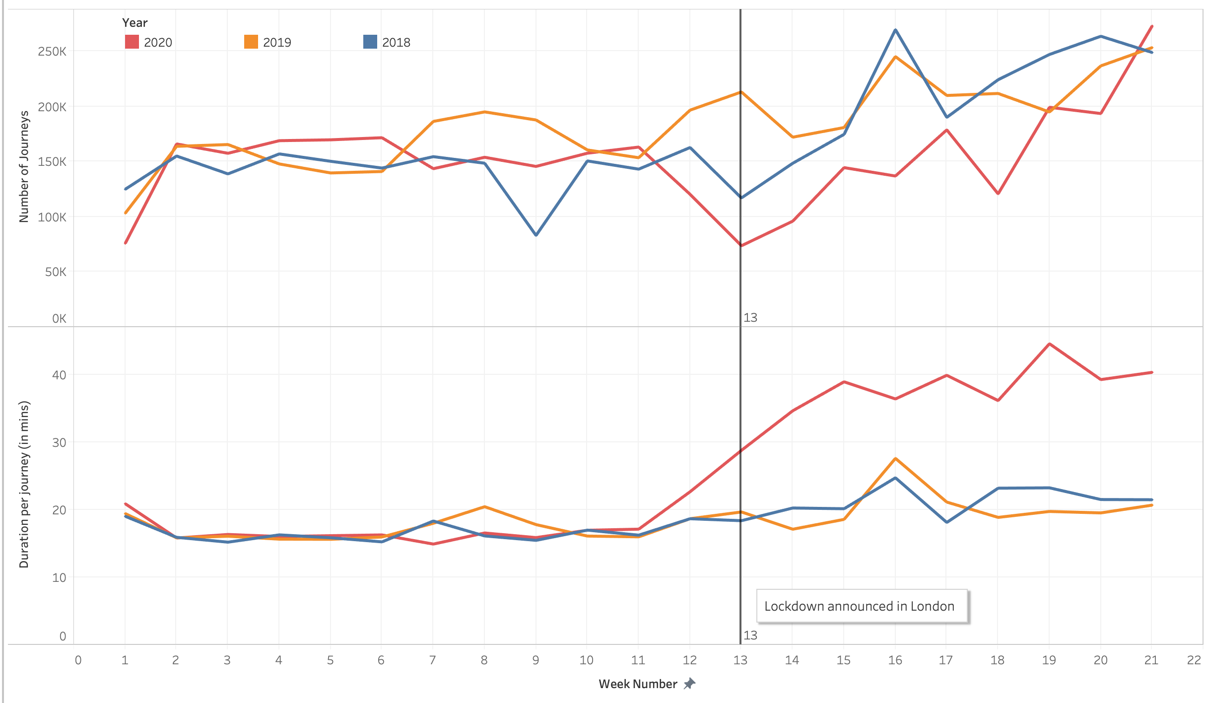
Overall year over year trends
Looking at the overall trends, we can see that the number of journeys between Week 11 through 21 is lower in 2020 compared to the same week numbers in previous years.
This could be explained by the fact that considering that March-May is prime tourist season in London, the lack of tourists due to the lockdown might be lowering the number of journeys compared to previous years.
Looking at the Duration per journey, however, we can see that 2020 has a higher average journey duration compared to previous years. Pointing to the fact that cyclists are cycling for longer.
Pre-Lockdown vs Post Lockdown
Comparing the 8 weeks of post-lockdown data to 8 weeks pre-lockdown, we see that in Pre-lockdown, cyclists made an average of 153K journeys per week and had an average duration of 17 mins per journey. Post-Lockdown data shows that cyclists made an average of 168K journeys per week at an average duration of 39 mins per journey.
Which docking stations are the most popular? has there been a shift as a result of the lockdown?
The video above shows the number of journeys starting or ending at the respective docking stations on the map. We can clearly see that for the first 11 weeks, the majority of the journeys are concentrated around hubs like King’s cross, Waterloo and Liverpool Street (all major corporate hotspots). After the lockdown was introduced in Week 13, we can see the journeys mainly distributed around parks and waterfronts like Hyde Park, Battersea Park and Regent’s canal (Week 14 – Week 21).
Another way of analysing the shift in popularity of docking stations would be to compare the number of journeys during Week 14 – Week 21 in 2020 to the same weeks in 2019. This can be seen below, with the most popular docking stations in 2019 having an even split between corporate and tourist hubs. On the other hand, in 2020, we can see the corporate hubs replaced by more parks and waterfronts.
| Docking Station Name |
|---|
| Hyde Park Corner, Hyde Park |
| Belgrove Street , King’s Cross |
| Waterloo Station 3, Waterloo |
| Black Lion Gate, Kensington Gardens |
| Albert Gate, Hyde Park |
| Waterloo Station 1, Waterloo |
| Hop Exchange, The Borough |
| Aquatic Centre, Queen Elizabeth Olympic Park |
| Storey’s Gate, Westminster |
| Wormwood Street, Liverpool Street |
Week 14 to Week 21, 2019
A good mix of Corporate hubs and Parks
| Docking Station Name |
|---|
| Wellington Arch, Hyde Park |
| Hyde Park Corner, Hyde Park |
| Queen’s Circus, Battersea Park |
| Clapham Common North Side |
| Bayswater Road, Hyde Park |
| Triangle Car Park, Hyde Park |
| Regent’s Row , Haggerston |
| Tooley Street, Bermondsey |
| Storey’s Gate, Westminster |
| Aquatic Centre, Queen Elizabeth Olympic Park |
Week 14 to Week 21, 2020
Corporate hub based docking stations have been replaced by more parks
Closing thoughts
To sum up, there has been a notable shift in the cycling activity amongst Londoners since the lockdown started and these changes can be clearly seen from the analysis.
Londoners are cycling for longer compared to the same period last year, despite there being less journeys this year (possibly due to reduced tourist activity). On average, the journey durations are a bit more than double that of previous years. Possibly pointing to the fact that the nature of the rides are more recreational rather than getting from A to B.
The popularity of docking stations used have also shifted from corporate hubs to parks and waterfronts. This can be attributed to the advice from the government to work from home wherever possible.
Even though these findings only pertain to Santander cycles, insight like this can be used to help shape our cities. As we see more citizens opting for greener forms of transportation, there’s a lot of potential for investing in cycling infrastructure encouraging people to cycle more in the city. This would hopefully lessen the strain on the public transport system and help us reduce our carbon footprint.
Taking this further: This project can be taken further by combining the Santander cycle data with data from other private rental companies like Jump, Lime, Freebike, etc. and other tracking systems measuring personal bike usage along dedicated cycle routes. This would give us an overall picture of the cycling activity in the city. At the time of writing this article, TFL only has data till the 26th of May 2020 as part of their archives. As newer data gets added we will get a better picture of the post-lockdown cycle activity.
I’ve added the R code I used to scrape, manipulate and analyse the data in the Git repo linked below. Feel free to fork it and use it for your own analysis. I’m excited to see how you can take this further.
Resources and Credits
Title image by Humphrey Muleba on Unsplash
